[hr]
West Hollywood Library
[hr]
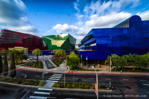
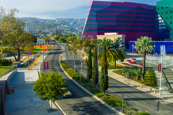
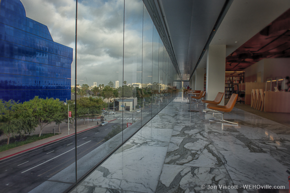
Fancy soirées and high-end hotels not your scene? You can enjoy a fantastic view for free. Just stop by West Hollywood Library, a sleek and shiny building with windows for exterior walls. Before you browse the stacks, take a gander from the library’s top story (technically the third floor — that’s counting the Jones Coffee/Council Chambers floor as the first story and the library’s entrance floor as the second). The view showcases the entirety of the glimmering Pacific Design Center as well as a gorgeous city view.
(Click the photos for a full view.)
[hr_dotted]
Wanted: Your Photos!
Whether they’re cell phone snapshots or carefully crafted photographs, we want your submissions. We welcome any photos that showcase great WeHo views, but we’re particularly keen to see your photos from: Chateau Marmont, SoHo House, the Pacific Design Center, the Mondrian, Sierra Towers and the famous Stahl House. If you’ve been to these places (probably for parties we couldn’t get invited to), send your best pics of the views to [email protected], or hit us up on Instagram using the hashtag #wehoviews.


Fantastic.More!!!! great job.
I love this. I’m going to try to submit some pics. This is a good idea. the pictures of the strip are great.
Hi KR, They do it because of the Marine layer. The Marine layer makes the sky look grey and they want photos that show the sky blue which makes the architecture/skyline “pop” against a “washed out” sky.
Photoshop was ONLY used to create the panoramas. We made the photographs in the late afternoon to get the best saturation of color and tried to catch sunsets when possible. A grad filter was used to prevent blown out skies and darken them up. Other photos were contrast balanced in Lightroom so you could see more detail in the shadow areas. We had a lot of skyline to cover with quite a variation in the sky. The sky was pretty clear and very blue on the days we were shooting. Go out and shoot on a clear day and show… Read more »
Why did you guys add SO MUCH blue to the photos. They are smothered in blue and that is a photoshop thing, not the way the scenes look in real life. Some people just go crazy with the photoshop.