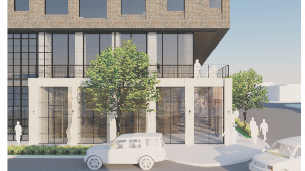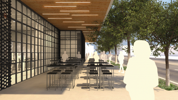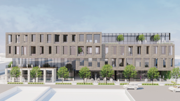
Faring shared preliminary design drawings yesterday of the building, dubbed the Laurel Project, that it proposes for the site now occupied by the French Market Place on Santa Monica Boulevard at Laurel.
The drawings were shared at a meeting to which local residents were invited and asked for input. The four-story building will have three levels of subterranean parking. It will include 50,000 square feet of office space, 8,600 square feet of restaurant space, 4,400 square feet devoted to shops and a 3,200 square foot space for a bar.
Faring’s Jason Illoulian said the building is designed with a washed out brick surface that “will feel like the building has been there a long time.” The project also will include an outdoor dining area, which was one of the amenities of the French Market Place.
Illoulian said the building’s office units are a major plus for West Hollywood. “There are no other proposed office projects in the area,” he said. “This will help make center city into a live work play zone and reduce traffic.
“The city needs to figure out how to incentivize office development,” Illoulian said. “All incentives are just for housing. Another interesting thing- WeHo parking requirements for offices are two times Los Angeles requirements. Another reason nobody builds offices.”
The French Market closed its doors last year, a move that was lamented by older members of the local LGBT community. The market’s French Quarter restaurant was known as a gathering place for members of the Municipal Elections Committee of Los Angeles (MECLA), a political action committee in the 1970s that raised money to support gay-friendly candidates. When news of the renovation became known in March, Rick Castro, in a posting on his blog, announced “FRENCH MARKET PLACE- THE END OF GAY.” Castro is owner of Antebellum Gallery in Hollywood, which bills itself as the only fetish art gallery in the United States. The French Quarter also has long been a gathering place for members of the LGBT recovery community.The restaurant also once was a popular weekend brunch place.


I would like to express my feelings on the proposed development at the French Market site. If any site has historical significance this does. For the record, I oppose this development as proposed. I remember when 2 of my closest friends and I went to the French Market to say a sad and final farewell to a restaurant the evening before it closed that held so many memories. During the early days of our petition drives to create this wonderful city, after walking the streets, talking to the minions of people, convincing them to put aside their fears of “what… Read more »
Wow, looks very creative and innovative. Reminds me of the Disney concert hall downtown.
Yay!! Office space. While many residents don’t realize this, there’s basically no office space along SMB that aren’t extremely expensive (PDC). Only one of these buildings is handicap accessible. I’ve long had the goal of finding this type of space for years. Yes, housing is critically limited, but placing residential space along a main thoroughfare doesn’t make much sense. On the other hand, the build is aesthetically lacking. Hopefully the developer will improve the design, by it’s definitely more attractive than the buildings around it. As far as the scale is concerned, 4 floors isn’t really that tall. Look at… Read more »
I don’t think Jason I. is referring to 8899 Beverly Blvd. That would be Townscape not Faring Capital.
Jason: I’m very familiar with the Beverly Blvd and Melrose/San Vicente projects, as I live in the neighborhood, and they are certainly NOT lauded by my neighbors. In fact, the Beverly project is in litigation. Both the Melrose/San Vicente and French Marketplace projects have tall walls built right to the sidewalk, which are neither charming nor pedestrian friendly.
Ugly! you guys can do better!
BEAUTIFUL! Farring does some amazing work – much better quality than other developers in this city. Looking forward to this getting built.
Oh yeah – that’ll blend. Is this taking out 7969, too? I love these “renderings” that never really show the surrounding buildings. But thank god we’re getting more retail space. I’m really looking forward to another row of perpetual “For Lease” signs.
Thank you for the feedback. In addition to the several meetings we have already held with neighbors, we will be hosting additional meetings where others can offer guidance. It is still very early in the design process, and we appreciate any constructive feedback that can be offered. Although we strive for exceptional design, I must admit that it takes time. It took time on our Doheny, Beverly Blvd and Melrose San Vicente projects, and the designs are now lauded by the neighbors in those neighborhoods. We will get it right. We conducted interviews with over 20 neighbors in Center City… Read more »
Glass and steel right to the curb is the current development plan for WeHo and this monstrous and boring building fits right in line with the rest of the really crappy designs we have seen crop up. Cumulative traffic impact and long-term neighborhood quality of life are not considered and this tasteless development is just another depressing brick in the wall.
I never comment about building design but this one I had to weigh in it is gross and oversized it is going to look out of place. This is just as bad as all of the houses in weho being torn down to have on oversized modern decor house put it next to a bunch of older charming houses with character. This look like it could be placed next to Wells Fargo Center or California Plaza in downtown.
how dare you all reject this design…remember, it’s for the social good.
don’t step out of line people.