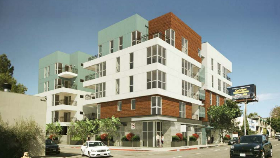
In a unanimous vote on Thursday night, West Hollywood’s Planning Commission approved a large retail-residential project on Fairfax Avenue, south of Santa Monica Boulevard.
The five-story, 60-foot tall, 34-unit building, with five of those units set aside for low income residents, will have 1,557 square-feet of ground-floor retail space. Covering three lots on the northwest corner of Fairfax Avenue and Romaine Street, it will replace three existing buildings that currently have seven residential units.
The Commissioners praised many aspects of West Hollywood-based architect Ed Levin’s design.
“I think Ed has done an amazing job of taking a Rubik’s Cube type of program and fitting it into a site,” said Commissioner Rogerio Carvalheiro. “I think the density is appropriate for Fairfax. I wouldn’t want to see this anywhere else in the city but Fairfax, because of the width of Fairfax, can handle this density.”
However, several members of the public felt the project was too large for the site.
“There’s too much building being squeezed into too small a space,” said resident Victor Omelczenko, who also felt the design was too similar to other buildings in the area.
Likewise, even though the project was within the zoning code, several commissioners felt it was too much.
“It seems to like it’s maximizing everything possible, making it as big as you possibly could, using every possible concession and whatever means you can use to get a little bit more. It seems overdone to me,” said Commissioner Sue Buckner.
Commissioner Lynn Hoopingarner agreed, saying, “It is just pushing every last micro-speck of space into this project and it’s rather massive.”
The Commissioners were happy the project was widening the sidewalk on that block of Romaine Street from the current five feet to eight feet.
“It’s a wonderful opportunity that we have here to activate Romaine as an urban street rather than a semi-alley,” said Commissioner John Altschul.
However, the Commission really wanted to see the sidewalk widened to a full ten feet. In additional, the driveway leading down to the underground parking garage is only wide enough for one car to go up or down at a time. A stop light within that driveway will alert drivers if a car is coming from the other direction.
Since the project has 19 spaces above what is required for commercial parking on the ground level, Carvalheiro suggested eliminating some of the extra spaces, widening the sidewalk to ten feet and expanding the driveway to allow for two cars to go up and down at the same time.
However, as they discussed the matter, the Commissioners realized such a plan would require a redesign not only of the ground level, but the upper levels as well. In the end, they encouraged the developer, Empire Property Group, to consider the redesign, but not require it.
Commissioner David Aghaei was absent, called away by a last-minute emergency.

1120-1124 Larrabee
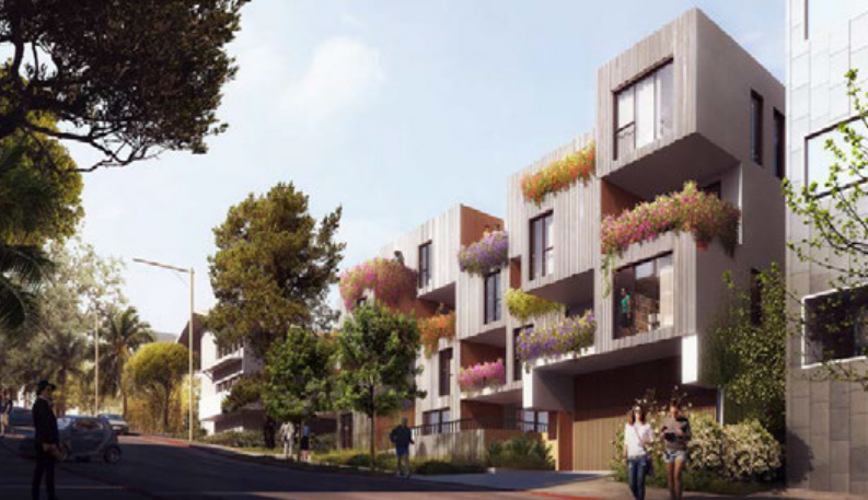
With a unanimous vote, the Commission also approved a new condominium complex on Larrabee Street, just north of Sunset Boulevard.
The four-story, 22-unit condominium project with two levels of underground parking at 1120-1124 N. Larrabee St. (directly behind the IAC building), will have five units set aside for low-income residents.
It will replace two single-family homes with accompanying accessory buildings that currently make up a total of five units.
The commissioners were impressed by the contemporary design, Commissioner Adam Bass calling it “an exceptionally beautiful building” while Commissioner Lynn Hoopingarner called it “really wonderful articulation.”
Owned by Abady Holdings Corporation, the project was designed by Ben Anderson of the Culver City-based R&A Architecture + Design. The building features large balconies for each unit, with planters for flowers hanging from the railings of the balconies.
The commissioners recognized the planters would help set the building apart and therefore were an integral part of the design.
“The building is beautiful, but when you take away the planting, it just looks like some boxes with some windows sitting out,” said Commissioner Sue Buckner. “I’m glad the developer is going to address those issues and make sure the proper plants will be maintained.”
Commissioner Rogerio Carvalheiro felt proper care of the flowering plants in the planters would be essential. However, he believed the project would be fine without the planters.
“This project could be equally eloquent without [the planters],” he said. “The sunlight raking across the custom metal panels during the day would be beautiful. I don’t think it would just look like a bunch of boxes. This project is eloquently detailed. If the landscape went away, the project would have equal merit.”
Of the 23 people speaking during the public comment period, 21 spoke in favor of the project. Many of them were people living nearby who complimented the design and said it would be a vast improvement over the decaying houses there currently.
However, Elyse Eisenberg, head of the West Hollywood Heights Neighborhood Association, spoke against the project, concerned that it would only have one space for guest parking. She said the five steep, narrow streets that make up the WeHo Heights neighborhood only have a total of 50 street spaces, which are generally used by residents living in buildings that don’t have enough on-site parking. Therefore, guest parking spaces within buildings is necessary, she said.
Commissioner John Altschul had to recuse himself from the deliberations because he lives within 500 feet of the project.
After the vote, Jeff Seymour, representing Abady Holding Corp., told WEHOville they were happy with the unanimous vote.
“We are very pleased with the vote tonight,” Seymour said. “We think the project is going to be an outstanding addition to West Hollywood and we’re looking forward to working toward its construction.”
New Commission Chair
During the annual rotation of leadership, Commissioner Sue Buckner’s one-year term as Commission chair ended and Commissioner Stacey Jones was voted in as the new chair. An appointee of Councilmember Lindsey Horvath, Jones joined the Planning Commission in 2015. She previously served on the Public Safety Commission and the Business License Commission.
“It is my honor and privilege to have been elected as chair of the West Hollywood Planning Commission for the upcoming year,” Jones told WEHOville. “It’s something that I take incredibly seriously. I try to weigh all of my decisions based on community feedback and what I think it right and fair. I’m very much looking forward to working with the public and staff and my fellow commissioners to make great decisions and built great projects in the city of West Hollywood.”
The Commission also voted in Commissioner Rogerio Carvalheiro as the new vice-chair. An appointee of Mayor John Duran, Carvalheiro joined the Planning Commission in 2017. He previously served on the Arts and Cultural Affairs Commission.

Ed Levin is a member of the WH Historic Preservation Commission. He, and any other architect sitting on a Commission or Board, should be prohibited from doing any business, even tangential, with the City. OR he should resign from the Commission. The latter would be the best solution.
A good call. I’ve often thought about this and expressed my concern to a few others in addition to contemplating a public request at a WHHPC meeting for Ed Levin to step down. He appears a clear conflict of interest and does not appear to be inspired to use is academic expertise to create a more livable community. Mr. Levin also demonstrates little respect for the spirit of Historic Preservation and similarly little respect for other talented practicing architects and designers while publicly degrading them at city meetings. At least one of them shows an understanding and versatility that far… Read more »
This bombastic building seems a clear illustration of the lack of aesthetic or spatial sensibility and respect for the neighborhood on behalf of its architect. The design might be befitting a larger structure on a main boulevard such as Wilshire or downtown LA but certainly not shoehorned into every perceptible inch, on a location where nearly 2/3 of it occupies a residential street. The architect appears hide bound by this design that has been replicated in several locations most noticeably on Norton east of Crescent Heights. All efforts to suggest refinement allowing that particular structure to recede in to the… Read more »
Another Frank Gehry 98% Modern Architecture is SH%T Award for this box on Fairfax.
Everyone in West Hollywood should watch All the Queen’s Horses on Netflix. Award-winning documentary on corruption in Dixon, Illinois where the city was ripped off for 51 million.
It could or may be happening in West Hollywood!
Great flick….in fact it’s 53.7 million
The city has 200 million in reserves. WTH are you talking about? Stop crying wolf about corruption. It is one of the best run cities in Ca, if not the country. Just cuz you’re unhappy with development doesn’t mean corruption. Stop it already.
saw it and thought the exact same thing!
Architectural opinions differ. I doubt a single architecture watcher, no anybody on Earth would call a Freak Geary (his at least last 20+ year record) as “BOXY OR LIKE SIMILAR BOX DESIGNS!
THERE are fans and haters of Frank Geary’s Designs and projects.
But similar & boxy is something nobody could accurately use to describe A Geary project.
I keep seeing the same design. Modern boxes, some set back, different color stucco – all generic. I guess it will work with the same boxes being built across the street, except the colors to “distinguish” some of the boxes are different. I know it’s up to the developer to choose the architect and then tell the architect what they want and what price they need it to be…. but is there no imagination at all? The driveway that can handle only one car at a time is a recipe for disaster during busy times. Overall? It’s a nothing. Just… Read more »
Congrats to Commissioner Jones! She is going to be a great chair!
Once again, the Planning Commission approves a huge box for the East Side. No style at all. Compared to what they approve in other parts of the City, it is apparent to me that they don’t give a sh*t about the East Side. They send back for style upgrades other projects, but never for the East Side. A box with windows, as huge as possible is fine for them. In what world is a driveway where two cars can’t go up and down at the same time isn’t a requirement is fine – only in East WeHo!
😂😂😂😂😂😂