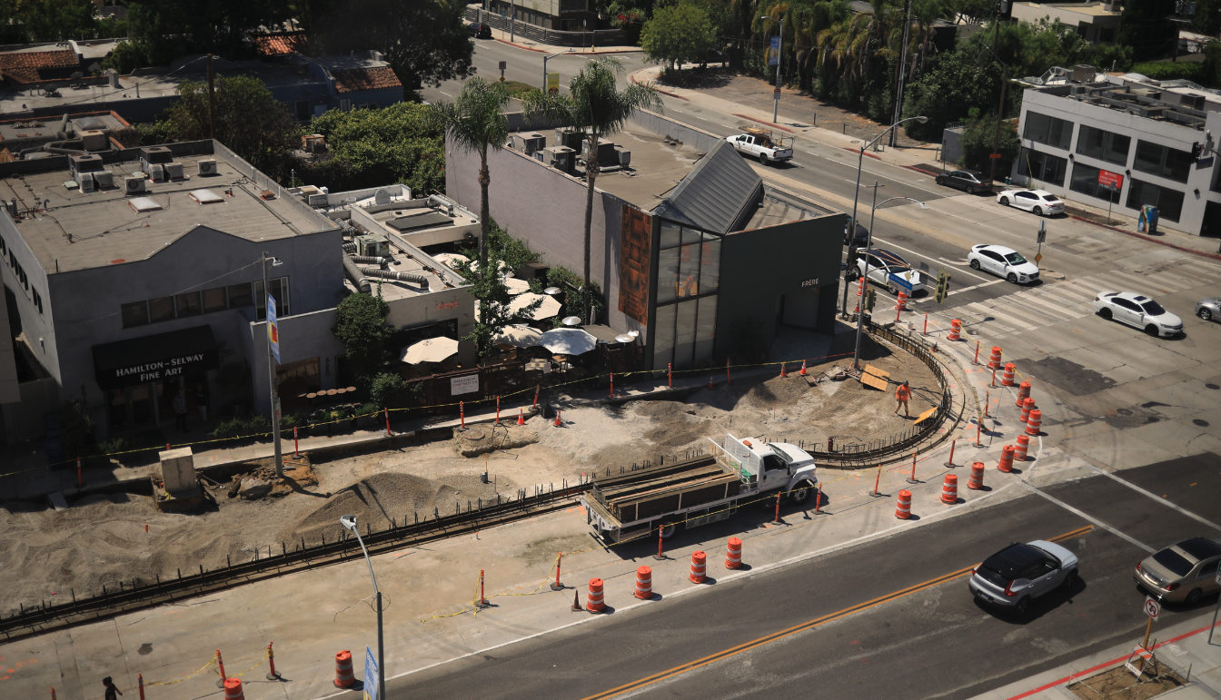
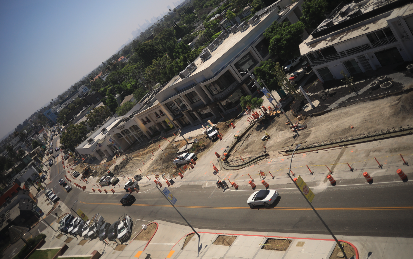
Major construction work is currently underway on Melrose Ave., part of the West Hollywood Design District Streetscape Project initiated by City Council in June 2011.
The work includes:
- Tree removal
- Painting (striping) of new traffic lanes, parking spaces, and road markings
- Utility relocations
- Removal and replacement of:
Concrete sidewalks
Curb & gutter
Driveways
- Removal and replacement of:
- Asphalt roadway pavement
Project Benefits
- Pedestrian and bicycle safety improvements
- New street pavements and sidewalks
- Distinctive trees and landscaping
- Upgraded street furniture and energy efficient streetlights
- Smart city infrastructure installation
- Utility undergrounding
- Creation of new public gathering places with integrated public art
- Electric vehicle charging stations, bus shelter upgrades, pedestrian safety crossing roadway lighting system, and WiFi system


12 years in the making yet they somehow didn’t make space for biking. Ridiculous given that it’s a flat shopping area with heavy foot traffic, and likely won’t be done over for another 10+ years. There’s still time!
What exactly are “ bicycle safety improvements”? If it’s not a protected lane it’s BS. No more sharrows!
Here we have a visionless, expensive project conceived of 10 years ago which is the capstone of the Design District which erased the original charming architectural buildings and courtyards in the original Design District. Rather that utilize them through Adaptive Reuse the public is left with a collection of uninspiring bland, soulless buildings and a treeless streetscape. Thankfully, the shards of the LACMA building were hauled to a landfill. Where are folks that should have vision and curiosity in the Planning Department?
Is this the standard 20 year project?
12 years in the making?! Can we please get an upgrade to the dated and deteriorating blue, globe light fixtures that run along SM Blvd? We got some new silver benches and trash cans but those ugly ass street lamps remain making our main boulevard look like it wasn’t designed very well.. And the SM Blvd medians could use a sprucing up too.
They are quite beautiful as a symbol of Route 66 and its distinctive design – when properly maintained. The deep blue is very California. The gold round ornament on the top very classic. They have just received ZERO maintenance for a decade by a city that sits on endless millions of $$. Look at the other elements in the public street; the graffiti everywhere, ripped up Big Belly cans, holes in the sidewalks, muck encrusted sidewalks, broken color lights across the road (out or having spasms), slopped painting on poles, missing trees. This is the priority – or more likely… Read more »
The streetlights in West Hollywood are classic Post-Modern designs of that era and it is sad you probably don’t know what this means.
Agreed! The blue and gold branding signage along La Brea, SMB and La Cienega are tired and ugly. Would be a great opportunity to have a contest for artists to come up with a new replacement? The globes on top of the streetlights are often burnt out and most have dirt and piles of bugs inside that can easily be seen.