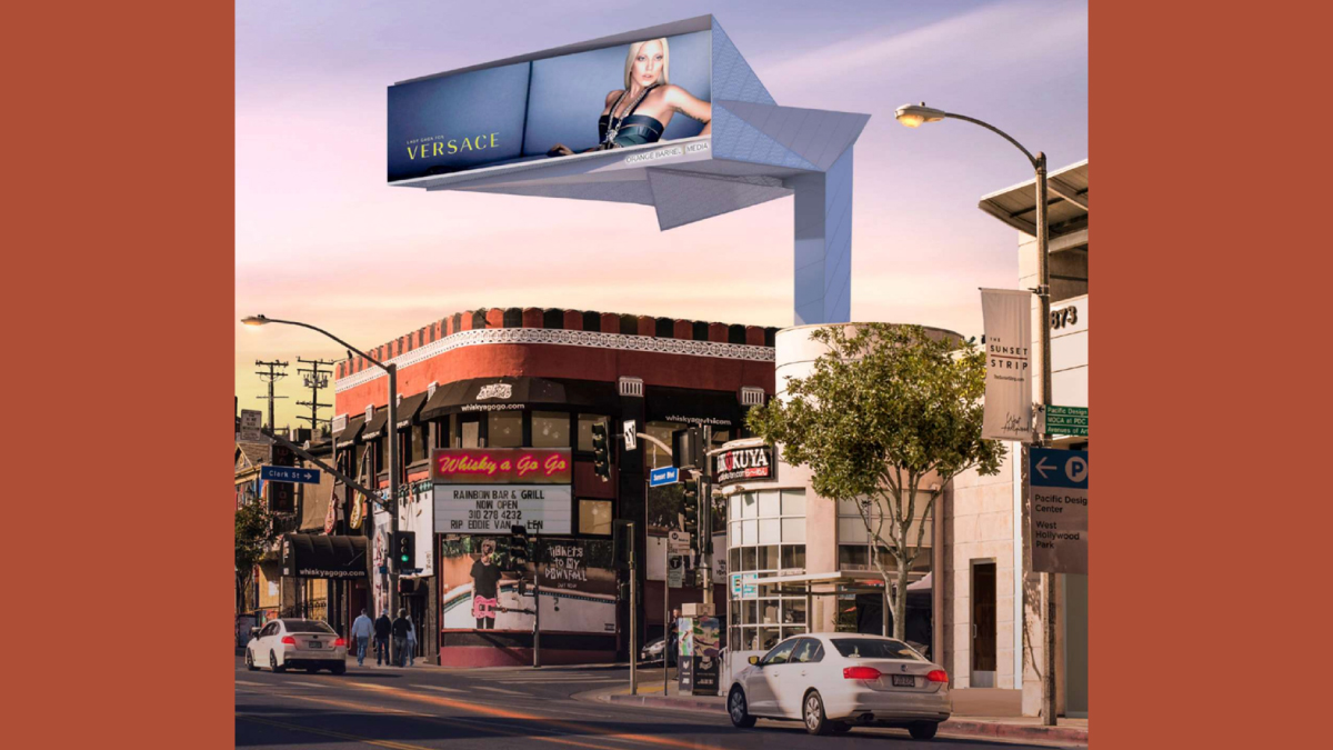
The billboard above the Whiskey A Go Go in West Hollywood is headed for a 21st Century makeover.
City Council this week approved the conversion of the static billboard that currently stands above the legendary club at 8901 Sunset Blvd. into a double-sided billboard with a 1,000-square-foot digital side and a 500-square-foot internally lit side.
The latest version of the billboard is slimmer and more streamlined than the original design, as requested by the Sunset Arts & Advertising Subcommittee, who were were concerned that the massing and bulk of the proposed structure was too large, that the building was dwarfed by the billboard structure, and that it loomed too closely over the building.
According to the staff report, the sign enclosure combines “the lightness of an illuminated lantern with the elegant folds of Japanese origami. The origami-inspired form evolves as motorists and pedestrians move around the site. Most
of the sign structure is clad with backlit perforated metal panels. The sign faces are angled east and west on Sunset Blvd and this orientation reduces impacts to the northern residential properties.
The 30-year development agreement guarantees more than $60 million in revenue for the city generated by the billboard, an average of more than $2 million per year. The contract also gives the city $330,000 to plan and build a commemorative walk honoring the music legacy of the Sunset Strip.
Monday’s meeting brought out many public commenters to speak in support of the billboard renovation, many of whom shared fond memories of the world-famous concert venue.
“I have worked in the community of WeHo for many years,” Katie Harvey told Council. “I actually bartended at the Whiskey years ago, and I have also been privileged to play and sing there several times. And obviously, we all know how special and historical it is in our community. And I think the income generated from the new board will help preserve the Whiskey for years. And the new design looks fantastic to boot. Definitely a major improvement from what is there now.”

Cheap and commercial looking. The reference to “origami” was evidently made by someone looking for a buzz word. Heckin silly.
What is the first thing that attracts the eye? Bingo…the billboard to heck with the heckin historic building/venue. That’s the way it was designed.
Welcome to Las Vegas
This is just gross. Like big brother using giant binoculars. The council and planning commission obliviously have no clue what origami is. Disgusting. This completely depreciates the historical significance of the Strip and particularly the Whiskey.
The billboard appears to be the Main Event dwarfing the Historic Resource. Will this be a contributor to the SUNSET STRIP MUSEUM OF BILLBOARDS? Even though this was designed as a revenue stream for the City and allegedly for the property owners who even during their “glory days” never gave a wit about the condition of their buildings. The individual that spoke as the Whiskey’s Financial Advisor was less than remarkable when he worked for Chase so who knows who or what is running this collaboration. Bottom line the design is less than marginal. The blind leading the blind down… Read more »
Which evil architect designed this one?
It looks ridiculous. Between this and the 8850 Sunset project, WeHo demonstrates how one needn’t have taste to design hotels or billboards
At 9169 W. Sunset Blvd. one can find the former Kohner Building designed for Paul Kohnert by Paul Williams. Always chic as an elegant moderne entrance to The Sunset Strip @ Doheny Drive. Now it has a giant billboard appendage lurking over it designed in the Art Nouveau style to mimic the tree branches. It’s not too bad but the designers who are producing these things have no concept of historic architecture or producing an authentic setting. Informed people unfortunately think it is silly.
If you weren’t at the last council meeting, you should watch it online and see the whole council tripping all over themselves praising a billboard. A BILLBOARD!! It was surreal.
Don’t mess with the Whisky, man? You’re going to get the ghosts of Jim Morrison, Eddie Van Halen, and Lemmy Kilmister haunting the Sunset Strip if you start messing with its iconic landscape. If you plan to show some Van Halen and Motley Crue videos on that digital billboard now and then, then go for it.